Fitts's, Hick's, Jakob's and Miller's laws: the UX laws that actually matter
You do not need to memorize every UX law to design better products. Four are especially useful because they map directly to common interface problems: target size, choice complexity, familiarity, and cognitive load.
PublishedAugust 31, 2026
CategoryProduct Design
Reading time4 min read
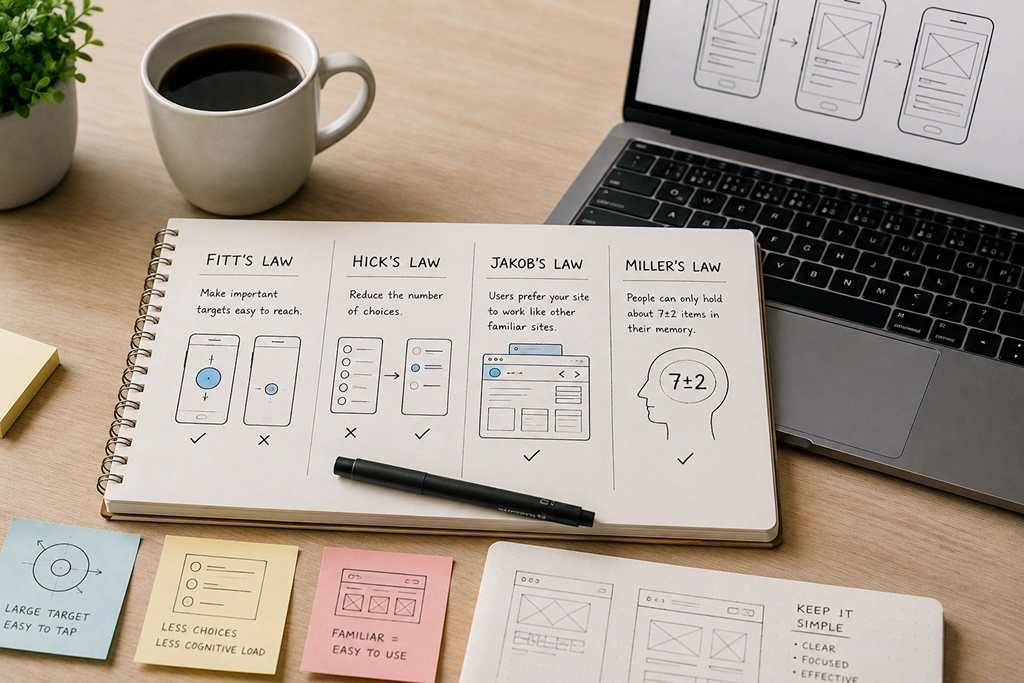
Fitts's, Hick's, Jakob's, and Miller's laws explain the most common interface friction—and how to design for reachability, choice, familiarity, and memory.
Fitts's Law
Make important targets easy to reach.
The time required to reach a target is influenced by its size and distance. In UI design, important buttons should be large enough and placed where users can reach them comfortably. On mobile, this means considering thumb reach and touch-target size. On desktop, it means avoiding tiny controls for frequent actions.
Hick's Law
Reduce unnecessary choices.
Decision time increases as the number and complexity of choices increase. This does not mean every menu should contain three items. It means the interface should distinguish between browsing and decision-making. Use grouping, search, filtering, defaults, and progressive disclosure when the option set becomes large.
Jakob's Law
Respect familiar mental models.
Users spend much of their time using other products. They therefore bring expectations about navigation, forms, search, carts, profiles, and settings. Innovation should improve the task rather than force users to relearn basic interaction patterns.
Miller's Law
Manage working memory.
Miller's Law is often simplified to the famous “7±2” idea, but the more practical lesson is to reduce cognitive load through chunking and clear organization. Use sections, meaningful grouping, progressive disclosure, and visible context. Imagine a checkout screen: Fitts's Law helps place the primary action, Hick's Law reduces unnecessary choices, Jakob's Law makes the flow familiar, and Miller's Law keeps the information manageable. The real value of UX laws is that they work together as design lenses rather than isolated rules.
Synthesis
How the four laws work together in one interface.
Individually these are tidy. Together they explain most of why some interfaces feel effortless. Fitts's law concerns the time to move to a target, driven by its size and its distance. Its practical payoff is that frequently used controls belong near where the hand already is, which is why primary actions sit within thumb reach on mobile rather than in a corner chosen for visual balance. Hick's law concerns choice reaction time growing with the number of options, so the answer to a long menu is fewer visible choices rather than a tidier long menu. Grouping, search, and progressive disclosure all work by reducing the decision set at the moment of choice. Jakob's law notes that people spend most of their time on other products and therefore expect the conventions those products established. It is the reason a save icon should save, and the strongest argument against reinventing familiar interaction for novelty. Miller's law, that working memory holds roughly seven items in familiar chunks, explains why ungrouped lists of options fail regardless of how clean they look, and why chunking into labeled groups works so reliably. Combined, they give a useful default: reduce the number of choices, group what remains, make the common targets large and close, and follow conventions users already carry from other software.
Pitfalls
Common misapplications of the laws.
These laws are widely cited and frequently misused, and the misapplications cause more harm than ignoring them. Miller's law is most often misquoted as a hard limit of seven items. The original finding concerns working memory in chunks, and the number is not a capacity you can load up to. The design lesson is to chunk and to structure, not to stop at seven. Fitts's law gets applied to touch targets, where it is useful, but it is sometimes stretched into a claim that everything important should be bottom-right. The law is about target size and distance, not about a preferred screen corner, and primary actions on desktop belong where the pointer already is. Hick's law is misused to justify removing functionality. It describes decision time growing with choice, not a mandate to cut features. Progressive disclosure, search, and good defaults reduce choices at the decision point while keeping capability available. Jakob's law is treated as an argument against any innovation, which overstates it. The finding is that familiar patterns reduce learning cost, which is an argument for a higher bar on novelty rather than a prohibition. The shared mistake in all four is treating a descriptive finding about human behavior as a prescriptive rule about design. They are evidence to reason with, not constraints to satisfy mechanically.
“UX laws work together as design lenses rather than isolated rules.”
Applying the four laws
- ✓Are primary targets large and easy to reach (Fitts's)?
- ✓Is choice count reduced where decisions matter (Hick's)?
- ✓Does the flow match familiar patterns (Jakob's)?
- ✓Is information chunked and organized (Miller's)?
- ✓Do the laws work together on the critical journey?
01
Reachability.
Fitts's Law: size and distance govern how easily users reach primary actions.
02
Choice and familiarity.
Hick's Law and Jakob's Law reduce decision cost and learning cost.
03
Memory.
Miller's Law keeps working memory manageable through chunking.
Written by

Vordx TeamAI & Software Engineering Team
The Vordx Technologies engineering team builds AI systems, web platforms, and digital products for startups and enterprises. We write about the architecture, cost, and delivery decisions that determine whether a software project actually ships, drawing on production work across AI development, backend systems, and product design.
Need this applied to your product?
Let Vordx review your UX, website, or product flow and identify the highest-impact trust gaps.
Start a projectRead next
More field notes from the Vordx studio.



Build with Vordx
Ready to create a digital product that feels impossible to ignore?
Bring us the idea, product, workflow, or brand moment. We will shape it into a premium experience built to launch, scale, and convert.
contact@vordx.com